Also known as a Dorling Map or Circle Cartogram.
A Dorling Cartogram is a Cartogram variation where each geographic region is represented by a circle, with the area being proportional to the data value being visualised geographically.
The circles in a Dorling Cartogram are positioned approximately in their corresponding geographic locations while avoiding any overlapping between them. This helps maintain a rough sense of the original geography and spatial relationships.
A variant of the Dorling Cartogram is the Demers Cartogram, which uses squares instead of circles and helps to reduce the gaps between shapes. While the Dorling Cartogram aims to keep each object’s final position as close as possible to its original geographical location, the Demers Cartogram sacrifices this to maintain contiguity.
Tools to generate this chart with:
ArcGIS
bertin.js
D3.js
Datawrapper
R (ggplot2, cartogram, sf)
Scimago Graphica
Vega
Examples
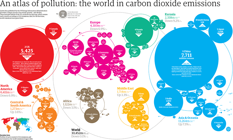
An Atlas Of Pollution: The World In Carbon Dioxide Emissions.
Infographic List
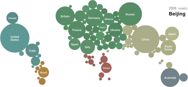
A Map of Olympic Medals.
Olympics — The New York Times
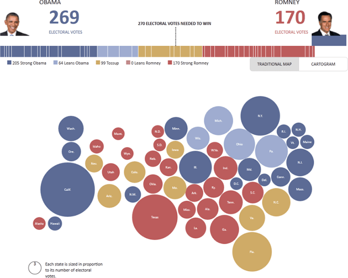
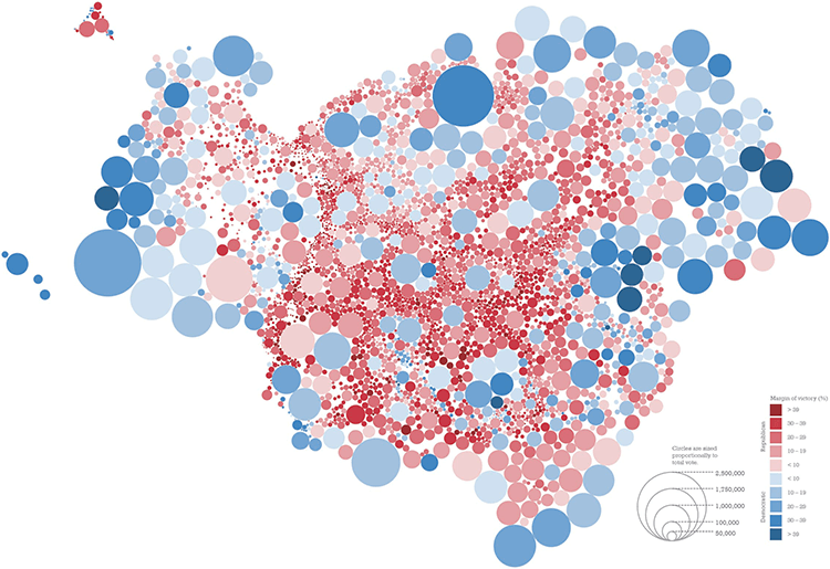
Romney vs. Obama (U.S.)
The Pollster estimate for the 2012 presidential election. — HuffPost Politics
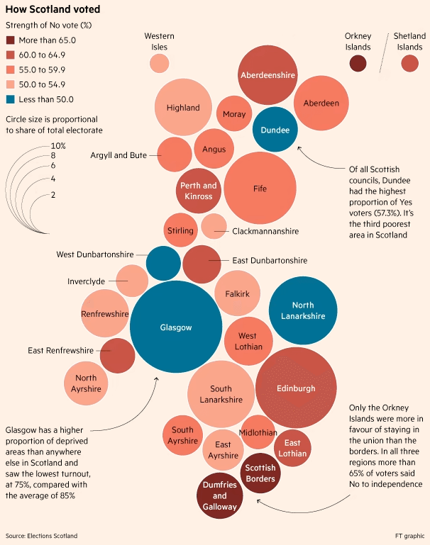
How Scotland voted.
Scottish referendum: How complacency nearly lost a united kingdom — Financial Times
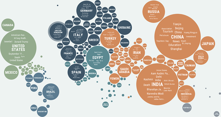
Unfiltered News: Topics and places the world is reporting on right now.
Kantar Information is Beautiful Awards 2016 Entry — by Jigsaw
Untitled (based on the winner of each state for the 2016 Presidential election).
Graphical cartograms in ArcGIS Pro — ArcGIS Blog / Kenneth Field
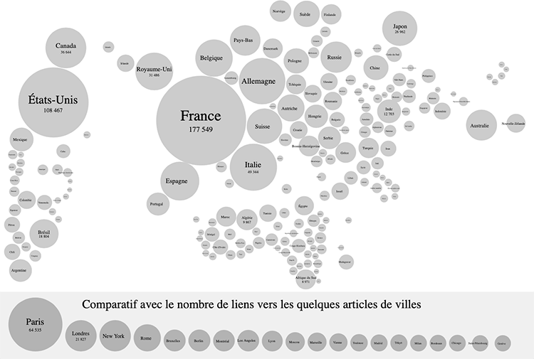
Carte proportionnelle au nombre de liens vers les articles de pays (2011-07).
Diagrammatic (Dorling) cartogram of the number of times each country is linked in the French-language — Wikipedia
Related posts:
Chart Snapshot: Cartograms
Chart Snapshot: Demers Cartograms
Further Exploration #6 Cartograms
