A DocuBurst is a chart that attempts to answer ‘what is this document about?’ through visualising the text-based content. The DocuBurst visualisation provides a summarised view of one or more documents by using a Sunburst Diagram that is generated based on word semantic relationships found in the lexical database WordNet. When visualising multiple documents, a DocuBurst can be used as a comparison tool for textual analysis between documents.
The occurrence counts of words in the document are overlayed onto the segments of the Sunburst Diagram to provide insights into the frequency and distribution of terms. Colour intensity (alpha) is also used to represent word frequency. When comparing multiple documents, colour is used to distinguish words from different document sources.
The centre of the Sunburst Diagram contains the root word or synset of interest and all child nodes proceed outwards and segmented in each concentric ring that represents a hierarchical level. The angular widths are proportional to the size of the subtree rooted at that node.
Interactivity can be used on a DocuBurst to zoom, filter, highlight, or refocus target words of interest.
Links to tools or code that can draw a DocuBurst:
- docuburst-desktop GitHub (Java)
The DocuBurst web tool is no longer online, but the video below demonstrates it’s functionality:
Examples of DocuBurst
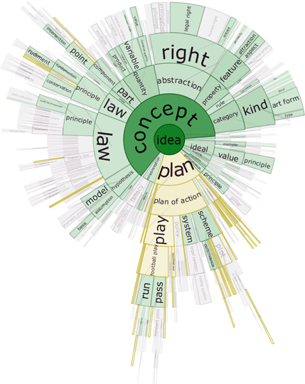
Figure 1: DocuBurst of a science textbook rooted at {idea}.
DocuBurst: Visualizing Document Content Using Language Structure — Christopher Collins / Vialab

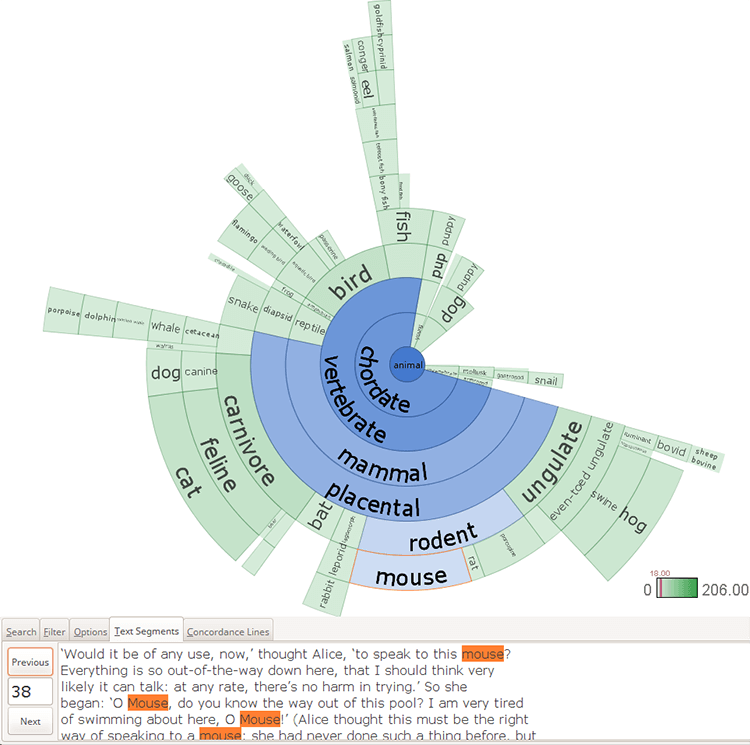
Visualizing Alice in Wonderland with “Animal” as the root word?
DocuBurst — Infoviz Wiki

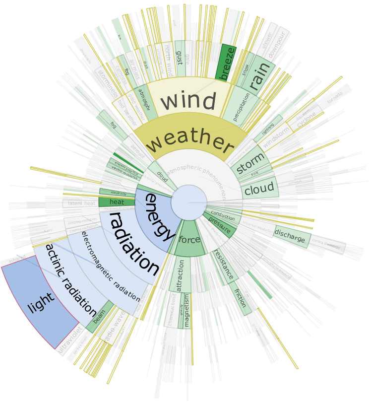
DocuBurst graph rooted at “atmospheric phenomenon”.
infoviz.info

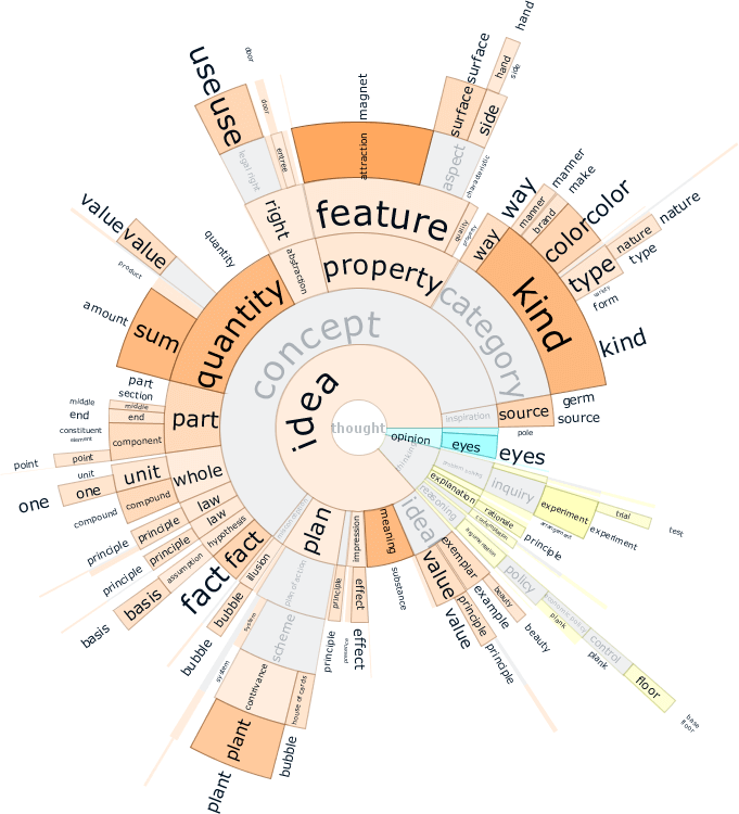
Occurrences of words in the document of interest (a science textbook).
infoviz.info

