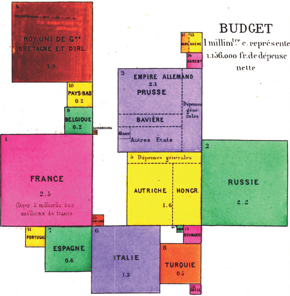
Also knowns as a Levasseur Cartogram, Square Cartogram.
A Demers Cartogram is a Cartogram variation where each geographical region is represented by a square, with the area of the square proportional to the data value being visualised geographically.
The organisation of the squares is loosely based on the original topology to avoid any overlapping. A Demers Cartogram aims to reduce the gaps between adjacent squares compared to Dorling Cartograms (which use circles instead) — this helps to provide a more contiguous appearance.
Tools to generate this chart with:
ArcGIS
D3.js, Chris Given’s Github
Datawrapper
Examples
One of a series of cartograms of Europe published in 1876 by Pierre Émile Levasseur, the earliest known cartograms ever produced.
Congrès international de statistique (9th : 1876 : Budapest, Hungary)
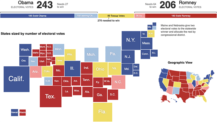
The Electoral Map: Building a Path to Victory.
The New York Times
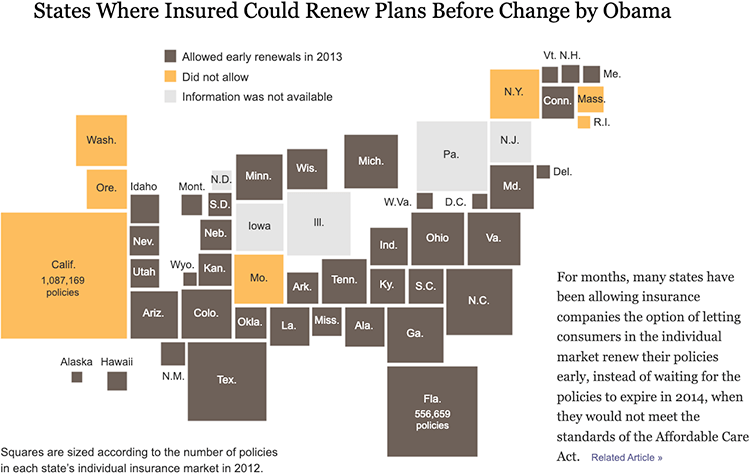
States Where Insured Could Renew Plans Before Change by Obama.
The New York Times
ELECTION2016 – CLINTON VS TRUMP
Huffington Post

Share of individuals using the internet, 2015.
Introducing Cartograms in Datawrapper — Datawrapper

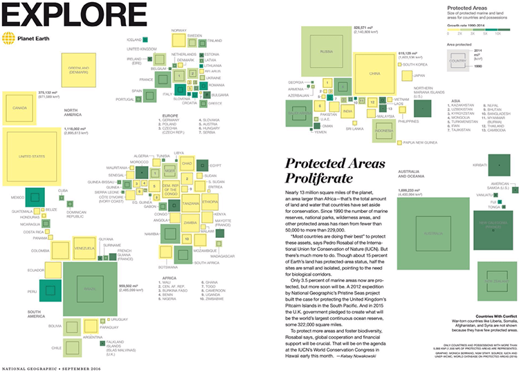
World Protected Areas.
Monica Serrano for National Geographic
Related posts:
Chart Snapshot: Cartograms
Further Exploration #6 Cartograms
