Also known as a Seasonal Subseries Plot or Monthplot.
A Cycle Plot is used to visualise and analyse seasonal patterns within time series data. They allow for the extraction and display of data for each season separately to help compare small units of time (such as weeks or months) across a larger time frame. This helps to provide insights into how seasonal patterns manifest over time and if there are any major changes across the seasons.
Cycle Plots are constructed by first specifying the length of the seasonal pattern intended to be analysed. Then the data needs to be organised according to its seasonal period length (e.g. monthly or weekly).
The X-axis is used for the larger time scale. So, with monthly data, all the January values are plotted (in chronological order), followed by all the February values, and so on. The Y-axis has the value scale used to plot the response variable.
Each seasonal subseries in a Cycle Plot resembles a mini Line Graph, which allows for the clear visual comparison of seasonal patterns across a larger period (e.g. the monthly patterns shown across different years). A horizontal line can be displayed within each of the mini Line Graphs to indicate the mean value.
Tools that can draw a Cycle Plot:
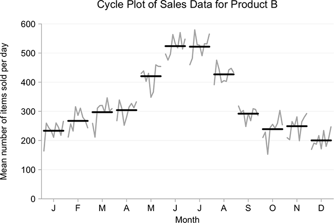
Examples of a Cycle Plot
Cycle Plot of Sales Data for Product B.
Charts and Cycles of Time – Part 2 — INFRAGISTICS
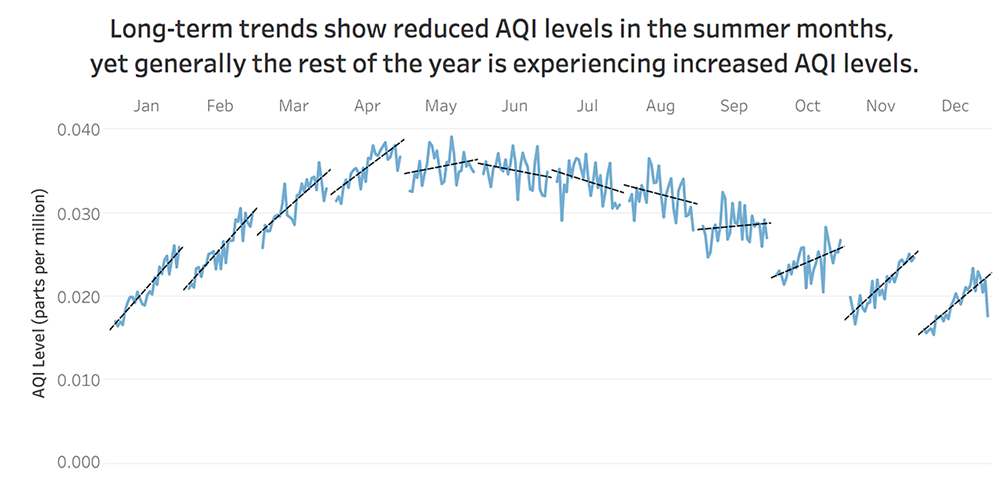
Long-term trends show reduced AQI levels in the summer months, yet generally the rest of the year is experiencing increased AQI levels.
Makeover Monday: Is America Improving Its Ozone Air Quality? — VizWiz / Andy Kriebel
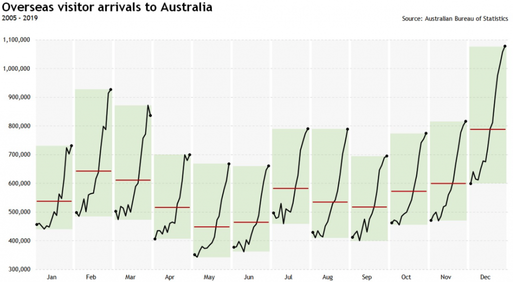
Overseas visitor arrivals to Australia.
Cycle Plot in Excel — ELOQUENS
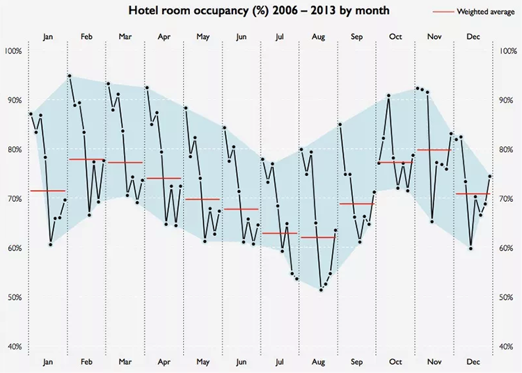
Hotel room occupancy (%) 2006 – 2013 by month.
To Find Seasonality Use Cycle Plots — simplexCT
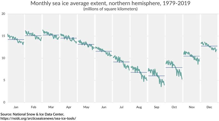
Monthly sea ice average extent, northern hemisphere, 1979-2019.
The Cycle Plot — PolicyViz
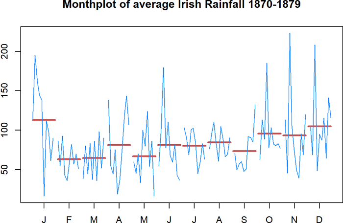
Monthplot of average Irish Rainfall 1870-1879.
RPubs by RStudio
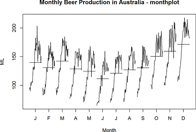
Monthly Beer Production in Australia – monthplot.
Time Series Analysis in R – Australia Beer Production, Edward Tsai — EPubs by RStudio
Aggregate to monthly data.
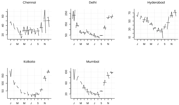
Air quality in Indian cities — R-bloggers