Also known as a Matrix Chart, Matrix Diagram.
A Correlation Matrix is a tabular form of data visualisation used for cross-examining multivariate data. This is done by placing variables in the rows and columns and varying-sized circle markers in the intersections.
Correlation Matrices are good for showing variance, occurrences, revealing any patterns, displaying any similarities, and detecting any correlations between the variables.
The rows will list all the entries for one categorical variable and the columns will do the same for its variable. The cells are the intersections of the rows and columns, which can either contain categorical or numerical data.
Inside the intersections are graph markers, typically circles, which vary in size in proportion to the data they represent. Colour can be used to colour-code categories or visualise an additional variable.
Tools to build a Correlation Matrix with:
D3.js
datylon
Flourish
R / corrplot, Option 2
Vega
Examples of Correlation Matrices
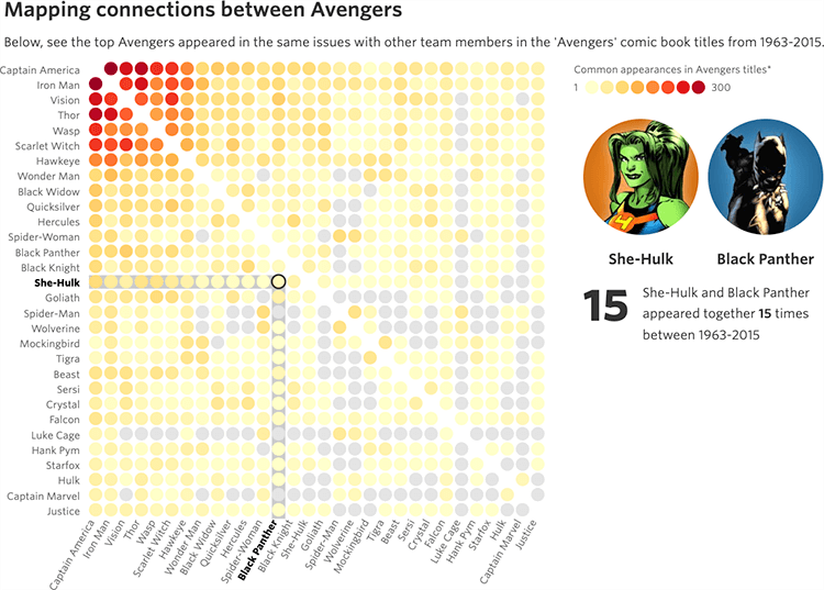
Mapping connections between Avengers.
How the ‘Avengers’ Line-up Has Changed Over the Years — WSJ
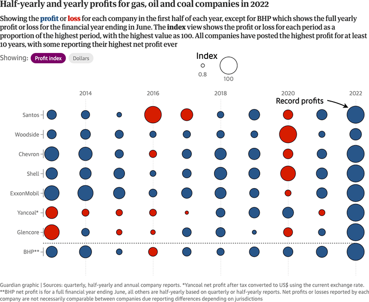
Half-yearly and yearly profits for gas, oil and coal companies in 2022.
Amid opposition to gas price caps, Australia’s resources companies make record profits — The Guardian
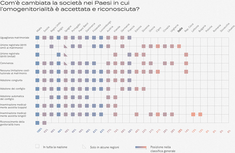
Com’è cambiata la società nei Paesi in cui l’omogenitorialità è accettata e riconosciuta? (How has society changed in countries where same-sex parenthood is accepted and recognized?)
Interference
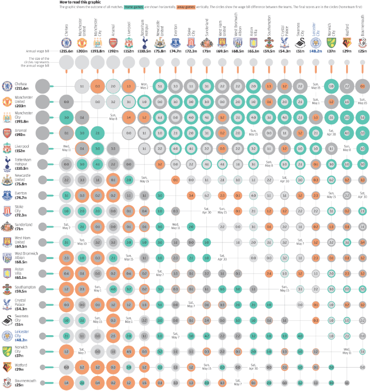
INFOGRAPHIC: Leicester ‘s Cinderella season.
South China Morning Post
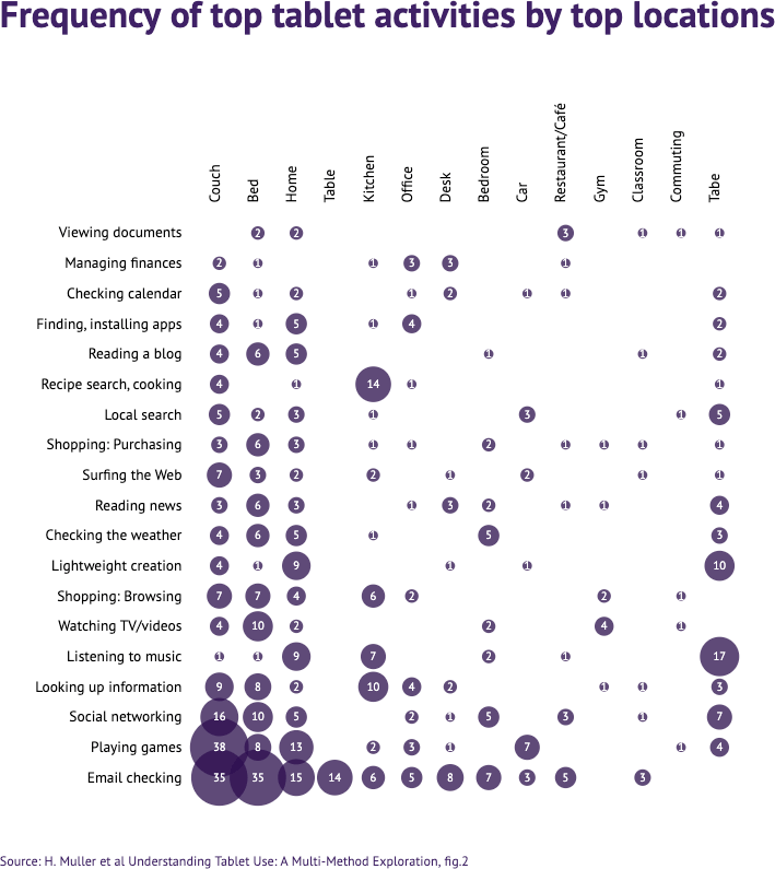
Frequency of top tablet activities by top locations.
Datylon Report Studio Inspiration
Recommended reading:
Heatmap (Matrix) chart reference page
