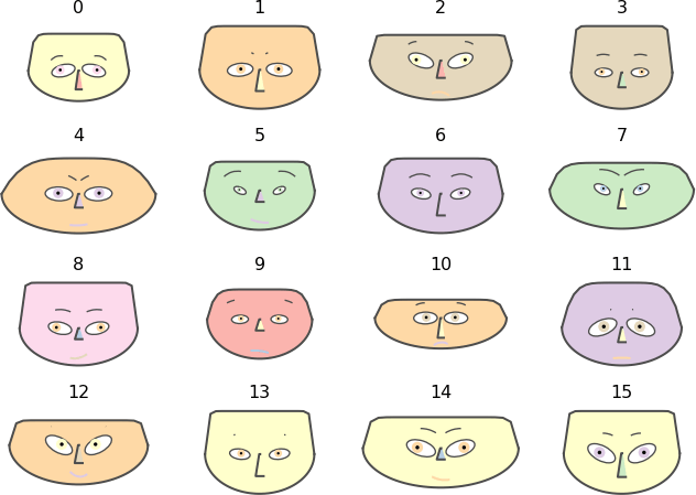
Chernoff Faces are a form of data visualisation invented by the mathematician Herman Chernoff in 1973 to display multivariate data by using a human face.
The rationale behind Chernoff Faces was that humans can more easily recognise faces and notice small changes, making them potentially useful for visualising complex multivariate data. However, there has been some disagreement with that assumption.
Each variable is represented using a different facial feature like the eyes, eyebrows, ears, mouth, nose, etc. The shape, size, placement, and orientation of these facial features correspond to values of different variables in the dataset. Bear in mind that some facial features may carry more perceived importance, so care must be taken when mapping variables onto them.
While Chernoff Faces are still occasionally used and discussed in the field of data visualisation, they are generally considered more of a novelty than a practical tool for data analysis.
Tools to generate Chernoff Faces with:
Chernoff faces for D3 + d3-plugin
R
Python: Option 1, Option 2
Examples of Chernoff Faces
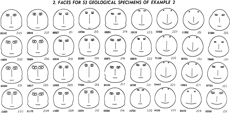
Face for 53 geological specimens of example 2.
The Use of Faces to Represent Points in K-Dimensional Space Graphically — Journal of the American Statistical Association, June 1973, Herman Chernoff.
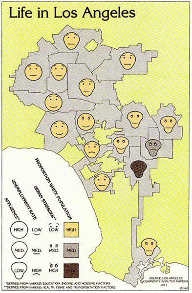
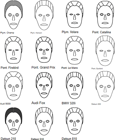
Life in Los Angeles.
Los Angeles Community Analysis Bureau 1971
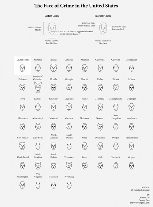
The Face of Crime in the United States.
How to visualize data with cartoonish faces ala Chernoff — FlowingData / Nathan Yau
ChernoffFace Python package example.
The Python Package Index (PyPI)
A Chernoff Face Diagram in Stata.
TechTips by SDAS
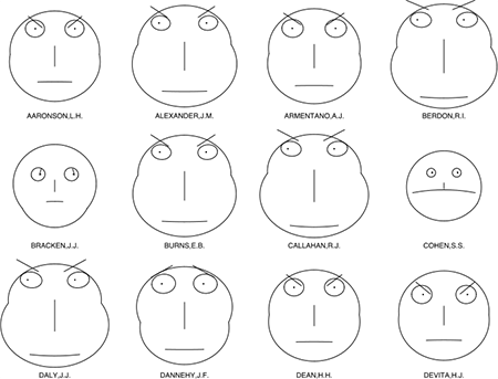
Chernoff faces for evaluations of US judges.
Wikipedia