A Fan Chart is a visualisation tool used in time series analysis to display forecasts and associated uncertainties. This chart combines the use of a Line Graph to represent the observed past data with a graduated Range Area Graph for future projections.
Each shaded area shows the range of possible future outcomes and represents different levels of uncertainty with the darker shades indicating higher levels of probability. Therefore, the central area indicates the most likely estimate, while each outer area progressively decreases the probability. Also, as the forecast extends further into the future, uncertainty grows, causing the shaded areas to widen and give this chart its distinctive ‘fan’ appearance.
Fan Charts are therefore useful for illustrating and forecasting the range of possible future changes in the data over time, helping to represent the increasing uncertainty of predictions. Fan Charts can convey that future outcomes are uncertain and that some outcomes are more likely than others. This helps to emphasise the probabilistic nature of forecasts and discourages the over-reliance on point estimates.
Tools that can draw a Fan Chart:
- fanchart (Python)
- fanplot (ggplot2 / R)
- Highcharts
- MathWorks MATLAB + Link 2
- pypi (Python)
Examples of a Fan Chart
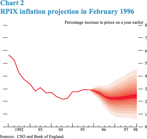
Chart 2, RPIX inflation projection in February 1996.
The Inflation Report projections: understanding the fan chart — By Erik Britton, Paul Fisher and John Whitley of the Bank’s Conjunctural Assessment and Projections Division.

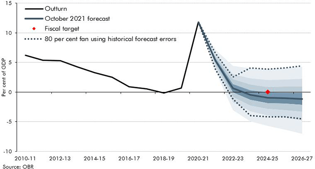
Chart B: Fan chart around current budget deficit.
Using stochastic simulations to produce fan charts — Office for Budget Responsibility

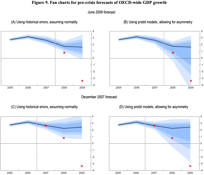
Figure 9. Fan charts for pre-crisis forecasts of OECD-wide GDP growth, June 2008 forecast.
Fan charts around GDP projections based on probit models of downturn risk — OECD

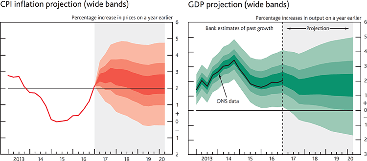
CPI inflation projection & GDP projection for May 2017.
As UK inflation rises, so real wages begin to fall — The Sloman Economics News Site

Related posts:
Chart Snapshot: Area Bands
Chart Snapshot: Range Area Graphs
