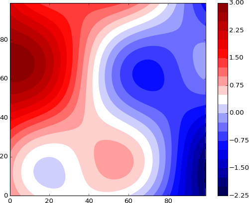
A Contour Plot is a visualisation method used to represent a 3D plotted surface onto a 2D graph. It displays the relationship and changes between two independent variables (X and Y) and a dependent variable (Z).
On a Contour Plot, the X and Y variables are plotted on the horizontal and vertical axes, while the Z variable is represented by contour lines or coloured bands. Tightly spaced contour lines indicate rapid changes in the Z variable, while widely spaced lines suggest that the changes are gradual.
Contour Plots allow for the easy identification of maxima, minima, and optimal combinations of X and Y variables that produce desired Z values. In general, Contour Plots are useful when you need to understand the relationship between three variables simultaneously or identify combinations of two variables that produce specific outcomes in a third variable.
Tools to generate a Contour Plot with:
Observable Plot (JS)
Plotly (Chart Studio and Excel) + Python version
Python: bokeh – matplotlb – seaborn
R / ggplot
Stata
Examples of Contour Plots
Volcano Contour Plot.
Make a Contour Plot Online with Chart Studio and Excel — Plotly
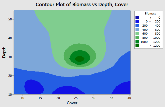
Contour Plot of Biomass vs Depth, Cover.
Contour Plots: Using, Examples, and Interpreting — Statistics by Jim
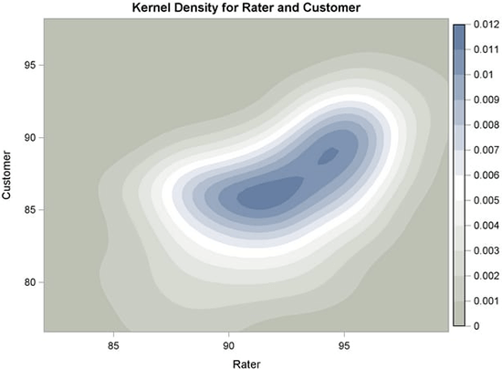
Kernel Density for Rater and Customer.
SAS/STAT(R) 9.2 User’s Guide, Second Edition, Example 45.6 Bivariate KDE Graphics
Filled Contour Plot — Advanced Plotting Toolkit
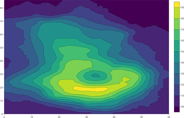
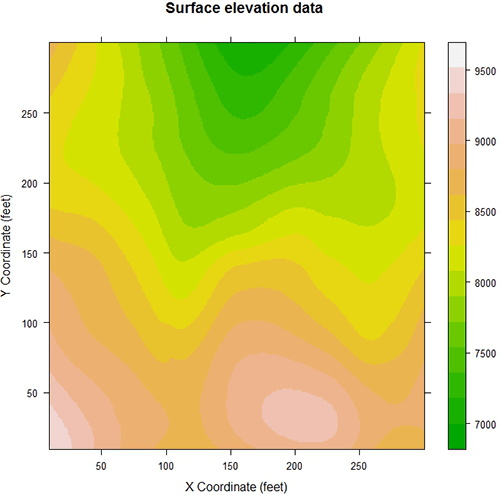
Surface elevation data.
Displaying data using level plots — Software for Exploratory Data Analysis and Statistical Modelling
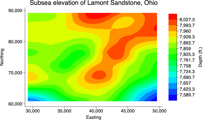
Subsea elevation of Lamont Sandstone, Ohio.
Contour plots — Stata