The Data Visualisation Catalogue isn’t the only library of data visualization methods out there.
A number of individuals have also taken it upon themselves to survey and present their findings on the different ways to visualize information. Some have focused on particular subjects such as visualizing time-based data, text visualizations or hierarchal structures. While others have created a more generalized list.
InfoDesignPatterns
Launched June 2008
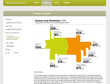
Originally, this project was written as part of a Master’s thesis in interface design titled “The Form of Facts and Figures” by Christian Behrens.
Although no longer online, this website collected a list of design patterns that described methods for effectively displaying interactive information graphics. While the list did contain a number of chart reference pages, it also included interactive design patterns for interacting with the data.
Behren’s project was influential in the creation of my own website and was probably also the inspiration for some of other libraries below.
Text Visualization Browser
textvis.lnu.se – Launched June 2008
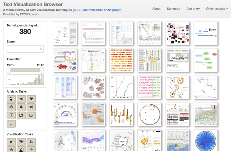
This project by Kostiantyn Kucher and Andreas Kerren, includes both a website and a paper, that focuses on collecting examples of visualization techniques that display text-based data.
Clicking on any of the charts on the grid will display more information on it, such as the publish date of the visualization, authors, categories and its source. On the sidebar, there are a number of options that allow you to filter the charts displayed in the collection.
Kucher and Kerren also have a very similar library dedicate to visualization techniques for sentiment data, called the SentimentVis Browser.
The TimeViz Browser
survey.timeviz.net – Launched December 2010
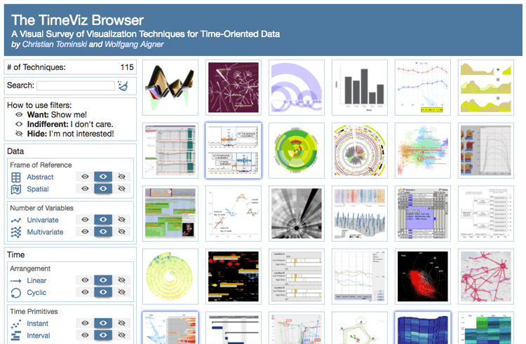
Christian Tominski and Wolfgang Aigner in their website have compiled “A Visual Survey of Visualization Techniques for Time-Oriented Data” to accompany their book.
As the title suggests, this resource contains a collection of charts that are used for time-oriented data. If you click on any of the image blocks, you’re presented with an example image, category icons, references and an excerpt from the book for further research. Like with the Text Visualization Browser, the library of charts can also be filtered down from the options in the sidebar.
A Visual Bibliography of Tree Visualization 2.0
treevis.net – Launched April 2011
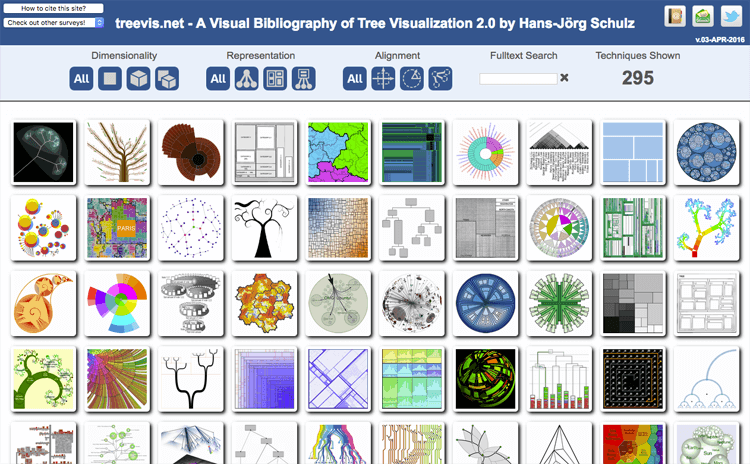
Hans-Jörg Schulz in his project has focused on collecting wide-range of charts that visualize hierarchal or “tree” based visualizations. This library functions in similar way to the Text Visualization Browser and The TimeViz Browser.
List of Physical Visualizations and Related Artifacts
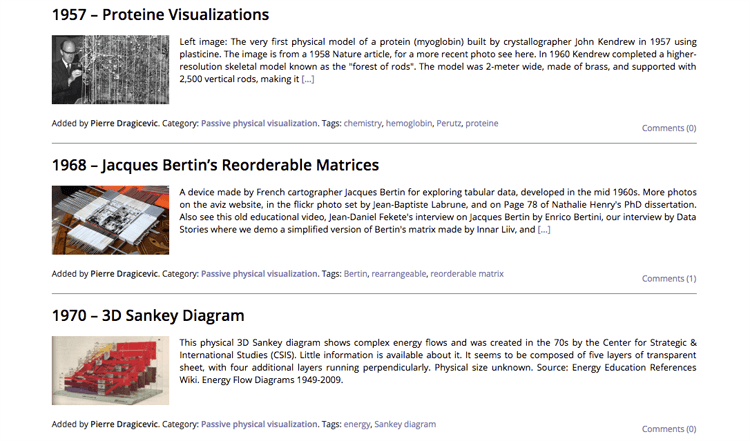
dataphys.org/list – Launched October 2012
Data doesn’t just have to be communicated in 2D or through flat surfaces – matter itself can be a useful medium to convey abstract concepts and visualize numbers. Pierre Dragicevic and Yvonne Jansen have chronologically listed a collection of data visualization examples in physical form or “Data Physicalizations” from ancient times through to the current day.
I think the field of data physicalizations (or DataPhys for short) is a fascinating new area to explore, especially as technology evolves. When virtual reality and augmented reality technologies improve, practitioners of dataviz may have to think more about designing charts in a 3D space. Also, the emergence of 3D printers now allows for more possibilities to produce charts in 3D space, as this technology makes it easier to manufacture unusual and complicated shapes.
A website such as Dragicevic’s and Jansen’s is a brilliant source of inspiration for projects involving visualizing data in 3D. Also, the project is currently on-going as Dragicevic and Jansen are continuing to add new additions to the page.
Vizipedia
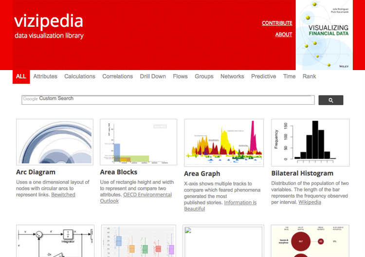
www.vizipedia.com – Launched August 2014
Created by financial data expert Julie Rodriguez, this website displays a list of different information visualizations in a grid view. On this website, an example image is provided alongside a short description and an external link to either an example of the chart type or a resource with further information. The navigation menu on the top allows you to organize the list by function.
Emery’s Essentials Chart Choosing Tool
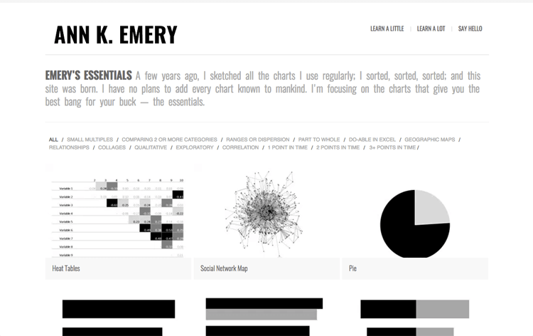
annkemery.com/essentials – Launched Spring 2015
On this website, Ann K. Emery has assembled a collection of popular charts (mainly graphs), which she has provided alongside them a short description on how each chart works, any useful resources related to it, as well as some linked examples online that have effectively implemented that chart. On some of the chart reference pages, Ann has also linked to tutorials (both in written and video formats) that guide you to create that chart in MS Excel.
Chartopedia
Just launched #Chartopedia to help you always choose the right #charttypes for #datavisualization tasks! https://t.co/UiGr4fnaSw #dataviz pic.twitter.com/jLOm48XLMF
— AnyChart (@AnyChart) January 18, 2017
www.anychart.com/chartopedia – Launched January 2017
AnyChart created a site similar to this one to help their users select the right chart and understand them better. Each chart reference page contains a description, an example visualization, a list of similar charts, the chart functions and also links to related resources within AnyChart’s website.

