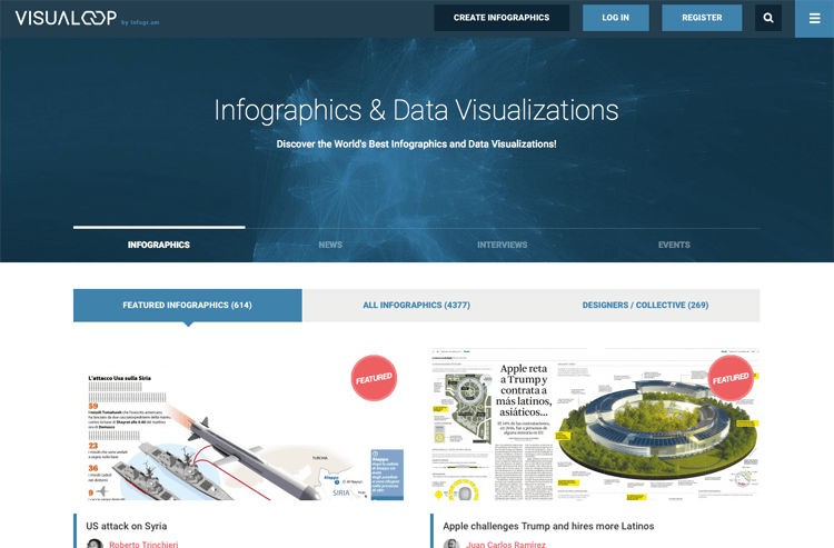
Back in 2015 I contributed a series of blog posts to Visualoop that looked deeper into each of the chart type I had already covered by looking into them in a bit more detail and at their history.
If you’re not familiar with Visualoop, it’s a website dedicated to showcasing the best pieces of infographic design and data visualizations, as well as featuring various designers in the industry. It’s both a great resource for designers looking for inspiration and also as a useful news source in the world of infographics and dataviz.
Anyway, here’s the list of blog post I contributed, which I think will be useful if you want to read into each of these charts more:
A Look at Arc Diagrams
http://visualoop.com/blog/29910/a-look-at-arc-diagrams
A Look at Area Graphs
http://visualoop.com/blog/30496/a-look-at-area-graphs
A Look at Bar Graphs
http://visualoop.com/blog/31776/a-look-at-bar-graphs
A Look at Box Plots
http://visualoop.com/blog/32470/a-look-at-box-plots
A Look at Bubble Charts
http://visualoop.com/blog/33526/a-look-at-bubble-charts

