 Page top
 Previous
 Homepage
 Next
Next
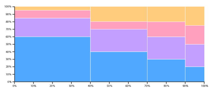
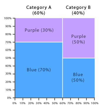
Marimekko Chart
Description
Also known as a Mosaic Plot.
Marimekko Charts are used to visualise categorical data over a pair of variables. In a Marimekko Chart, both axes are variables with a percentage scale, that determines both the width and height of each segment. So Marimekko Charts work as a kind of two-way 100% Stacked Bar Graph. This makes it possible to detect relationships between categories and their subcategories via the two axes.
The main flaws of Marimekko Charts are that they can be hard to read, especially when there are many segments. Also, it’s hard to accurately make comparisons between each segment, as they are not all arranged next to each other along a common baseline. Therefore, Marimekko Charts are better suited for giving a more general overview of the data.
Functions
Anatomy


Tools to Generate Visualisation
Code-based:
AnyChart (JS)
FusionCharts (JS)
JSCharting (JS)
Mike Bostock’s Block (D3.js)
Vega-Lite
Webapp:
Charticulator
plotDB
Desktop App:
Tableau
Check out our fast-paced, data visualisation-themed card game:

Merchandise & other related dataviz products can be found at the store.

