 Page top
 Previous
 Homepage
 Next
Next
Calendar
Description
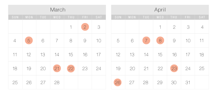
Throughout human history, various calendar systems have been developed as an organisational tool to help us plan ahead. Calendars as a visual tool are used to display periods of time and to display the organisation of events. Periods of time are often displayed and divided into units such as days, weeks, months and years. A date is the designation of a single, specific day within such a system.
Today, the most common form of Calendar is the Gregorian Calendar. Typically it's displayed in separate monthly grids of seven columns (for each day of the week) and five to six rows. However, the format for any calendar is not set in stone so their design can vary, so long as they visually show the chronological sequence of dates or time units.
A list of different ways Calendars can be combined with other forms of data visualisation can be found here.
Functions
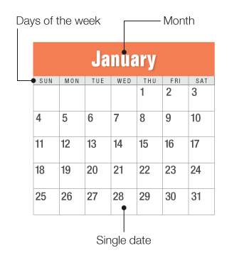
Anatomy
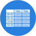
Similar Charts
Tools to Generate Visualisation
Code-based:
AnyChart (JS)
Google Charts (HTML5)
JSCharting (JS)
Vega
ZingChart (JS)
Webapp:
Canva
Google Docs
RAWGraphs
timeanddate
Venngage
Visme
Vizzlo
Desktop App:
Apple Numbers
Microsoft Excel
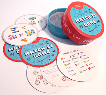
Check out our fast-paced, data visualisation-themed card game:
Merchandise & other related dataviz products can be found at the store.

