I decided to experiment with a new format because I had recently got in touch with a guy who’s work looks very intriguing. Instead of communicating completely by e-mail, I thought it would be easier to just chat via Skype. But I also thought it would be a good idea to try record our conversation so that others could take away something from it as well.
So I set up an online interview with this fellow Finn Fitzsimmons, to record him explaining his work in more detail. There are a few DataViz podcasts out there already, but for me, I thought the video format would be better because I felt it was important to also display Finn’s work. Data visualization is a subject focused on visual communication, so I think you need to be able to visually show what you’re talking about, rather than just explain everything in words.
This was my first time arranging such a thing, so, unfortunately, there were some technical issues and the video didn’t come out as planned. But that’s fine because it’s all part of the learning process.
Despite the lagging recording, the audio was completely fine and I fixed the video so that you could properly see Finn’s work. I will need to spend some time researching on how I can prevent these problems in the future.
I’m not sure if these videos will be a regular thing, but I thought it would be worth trying out. I felt the work Finn was doing was important and would be interesting to others. So another motivation for producing this video was to raise awareness of Finn’s work. He’s been unsuccessful in finding a publisher for this book, so maybe someone after watching our talk would be interested in helping him out.
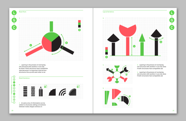
Number Picture
The project I found the most interesting of Finn’s is Number Picture, which is a book that attempts to catalogue every possible chart, chart variation, and chart combination. Here, Finn has focused on visual variables, which are like the fundamental building blocks of charts and has attempted to create as many different combinations from them as possible, even if the result is not always practical.
Here’s a sample of one of the book’s pages, which experiments with some of the different variations you can get by combining bars with pie chart slices:
For a while now, I also had the idea to also produce a similar book, which was to play around with as many different chart variations and combinations that I could come up. I’ve recently been writing on the blog on the concept of “Chimera Charts” and also experimenting with chart combinations. However, unfortunately for me, I don’t have the time or money to undertake such an ambitious project and produce an entire book on the subject.
That’s why I’m looking to Finn’s book being published. From what I’ve seen so far from the project, it looks fascinating. Not only would this book be interesting for research purposes and developing my understanding of the design and construction of charts, but also I think this book would be an excellent source of inspiration.
Anyway, you can listen to our conversation in the video below:
Topics:
Introduction – 00:00
What got you into dataviz – 01:47
Moving to Sofia, Bulgaria – 03:55
JS Charting Library Potion.js – 11:15
Number Picture – 18:25
450+ charts discovered and book – 22:00
Why focus on visual variables – 31:00
Chart fatigue – 32:25
Universal chatting principles? – 34:55
Future plans – 37:24

