2020 is finally over, so as per tradition the publishing of the website statistics on the most popular chart reference pages is to be obliged.
The data used here are taken from the English side of the site and ranges from 1st January 2020 – 31st December 2020, with the previously mentioned years follow the same date range.
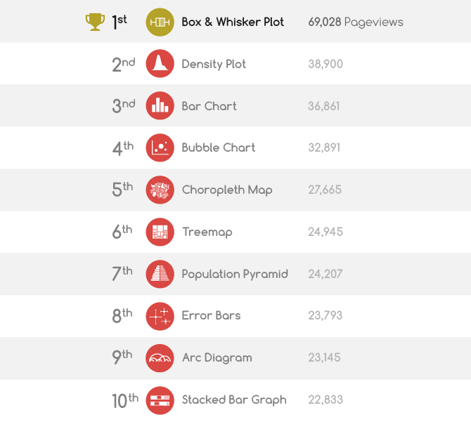
So let’s explore the website statistics from the recent past year with a series of tables and visualizations. First up, here’s the list for the top 10 chart reference pages in 2020:
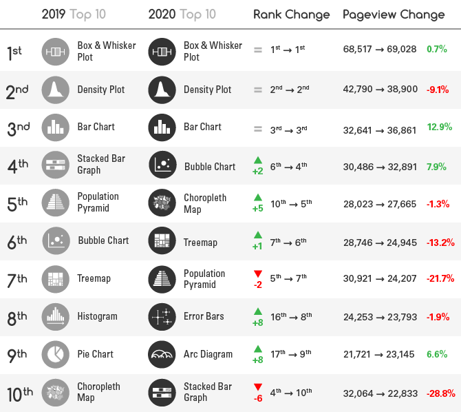
If we look back at the data from the previous year (2019), we can see that not a huge amount of change has taken place:
The 3 top charts, Box & Whisker Plot, Density Plot, and Bar Chart have all maintained their positions from last year.
The rest have shifted their positions within the top 10, with the only new editions to the list being the Error Bars and Arc Diagram.
However, many of the pageview numbers have dropped for 6 out of 10 of the chart reference pages, which wasn’t the case last year.
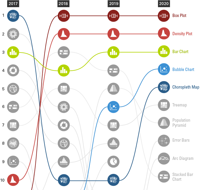
If we look at the data through a Bump Chart, we can see how the rankings of the top 5 charts have changed over the past four years:
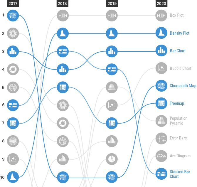
While we can also see that 5 of the charts have been able to stay in the top 10 over the 4 years:
If we look at the yearly pageview statistics, we can see the growth of each page over the 4-year period:
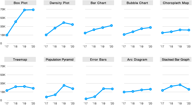
Overall, there hasn’t been any dramatic changes in the past year, some pages have stayed the same, some have grown a little, while others have even gone into a slight decline.
Posts from the previous years:

