It’s been awhile since I’ve done one of these posts (the last one being on Area Graph Variations), so I wanted to get back into looking at different chart types. In this post, I will be exploring the kinds of triangular chart that I’ve come across.
Ternary Graphs
Also known as a Ternary Plot, Trilinear Graph/Plot, Triangle Graph/Plot, Simplex Plot, De Finetti Diagram, Gibbs Triangle.
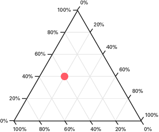
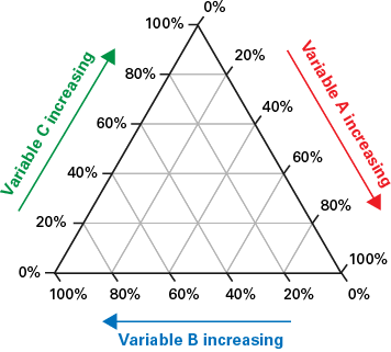
This triangular-shaped graph is used to plot a dataset with three variables, where the sum of all three adds up to a constant amount. Typically the data is in percentages or in an equivalent decimal form. Ternary Graphs visualise the ratios between the three variables, by simply positioning a dot in accordance with its position on each of the three axes (using barycentric coordinates).
To understand how to read and draw Ternary Graphs, I would recommend you watch these two videos if you’re not familiar with this type of graph:
There are a few different uses for Ternary Graphs. One of them is to find correlations between three variables. Another use is for classification, which is done by breaking up areas of the graph into different categories like in the examples below:
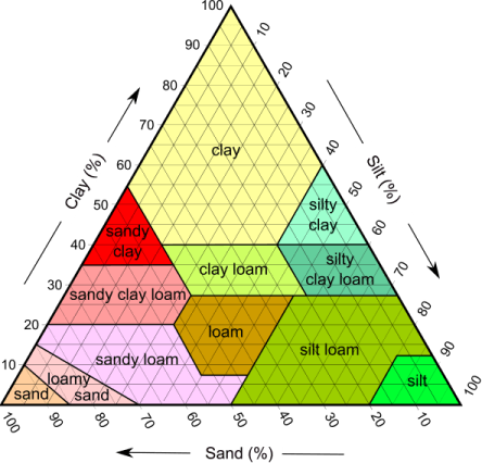
Then after when you plot any data points, you’ll see from their positioning on the graph what category the data points fit into. This makes Ternary Graphs useful in the fields of physical science, such as in geology, physical chemistry, petrology, mineralogy, and metallurgy.
Ternary Graphs can also visualise how data is distributed in a dataset. A good example of this is from FiveThiryEight’s article on The Worst Tweeter In Politics Isn’t Trump. Here an analysis was done on Trump’s tweets to see whether they got more retweets, replies or likes, and also have his tweet posts data compared to Obama’s:
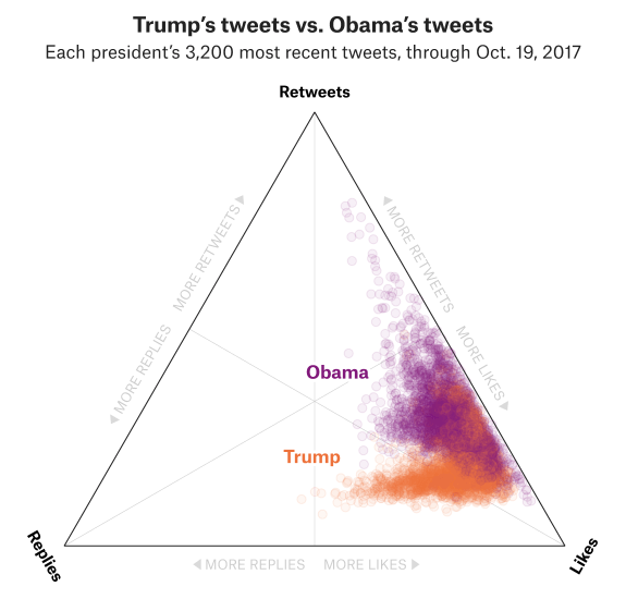
You can also see in this graph that multiple data series can be distinguished from one another on the same graph by using different coloured points.
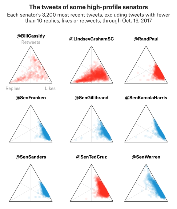
Small multiples have also been used in this article to visualise and compare different patterns across the Twitter profiles of nine US senators:
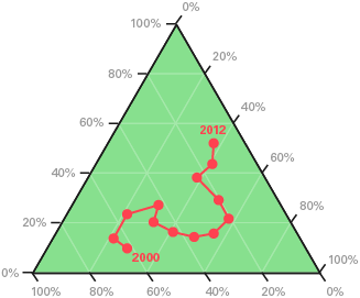
Connected Ternary Graphs
Time-based data can also be displayed on a Ternary Graph by connecting points together with lines or arrows:
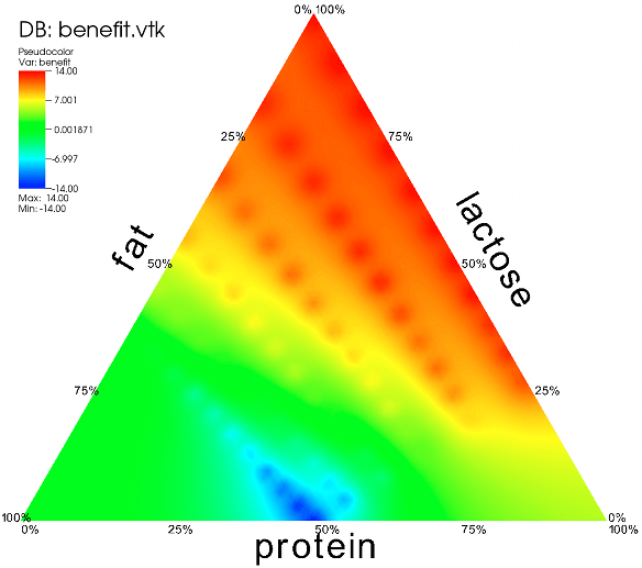
Ternary Contour Graphs
This variation of a Ternary Graph displays three explanatory variables and a fourth response variable, which is visualised in the varying shades of colour:
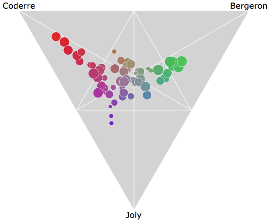
Ternary Bubble Graphs
Another way to add a fourth variable to a Ternary Graph is to vary the area size of the data points. In the example below, the circles each represent an electoral district that is plotted against three political candidates (Coderre, Bergeron, Joly) and the area size of the circles is proportional to the number of votes cast:
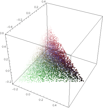
3D Ternary Graphs
Someone has also extended a Ternary Graph into 3D through using a tetrahedron: