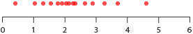
In the previous post, Further Exploration #4 I researched into what alternative Boxplot variations are out there. However, I didn’t include all the Boxplot variations that I had discovered. This is because from researching into the subject, I found that many of the Boxplots we’re familiar with, visualise 1D (one-dimensional) distributions. What this means, is that these charts display the distribution of data on a single scale/axis.
However, there are a series of Boxplot variations that can display the distribution of data over two, three or even more dimensions. In their paper 40 years of boxplots, Hadley Wickham and Lisa Stryjewski mention that extending the Boxplots to work in more then one dimension was no easy task:
Extending the boxplot to work in 2d is challenging because of the difficulty of defining order statistics, depth and quantiles in 2d. There is no unique definition of rank in 2d dimensions, and hence the 2d analogues of medians, fourths and extremes becomes more complex (mathematically and computationally). Perhaps due to the increased complexity of creating just a single plot, there has been little development of effective methods for comparing multiple groups. Compared to 1d, it is less obvious that 2d boxplots provide significant advantages over contours of density estimates or heatmaps of binned counts.
– Pg. 9, 40 years of boxplots
Despite this, people have still be able to develop a number of functional solutions, which I will cover in this post.
Rangefinder Plot
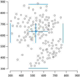
S. Becketti and W. Gould in 1987 in American Statistician (page 149) were the first to attempt at extending the Boxplot into 2D with their ‘Rangefinder Plot’. This chart uses each axis to plot two variables along, much like in an Scatterplot. Two-way whisker markers are then drawn onto to the plot to display the average positioning and the quartile ranges.
Relplot
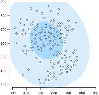
One of the next attempts at producing a 2D Boxplot was in 1992 from K. M. Goldberg and B. Iglewicz with their chart, the ‘Relplot’. Instead of using whisker markers like the Rangefinder Plot, the Relplot plots coloured bivariate gaussian ellipses onto the chart. The most central ellipse represents the box area (where 50% of the data is distributed) and the outer ellipse represents the ‘extremes’ and where the ends of the whiskers would be extending to on a standard Boxplot.
Quelplot
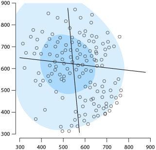
During the same time, Goldberg and Iglewicz also developed another chart, the ‘Quelplot’. This chart differs slightly from a Relplot by adding two degrees of asymmetry to account for residuals on the both axes for the ellipse, as well drawing two crossing line markers.
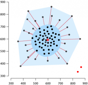
Bagplot
As known as a Bivariate Boxplot or Starburst Plot, the ‘Bagplot’ was first introduced by Peter Rousseeuw. The Bagplot is useful for visualising the location, spread, skewness, and outliers of a dataset. Construction of a Bagplot involves these parts:
The Depth Median: this is represented with an asterisk symbol near the centre of the graph and is the point with the highest half space depth / Tukey depth.
Bag: the innermost polygon that is constructed based off the Tukey depth and contains at most 50% of the data points.
Fence: the outer polygon that is a magnification of the Bag by a factor of 3. Data points outside the Fence are considered outliers.
Loop: the space between the Bag and Fence that contains all the observations between the two.
Whiskers: can be shown in various ways, but in the example below, they use connecting lines from the Bag to the data points within the Loop.
Further reading:
- The Bagplot: A Bivariate Boxplot, Peter J. Rousseeuw, Ida Ruts, and John W. Tukey
- 40 years of box plots, p.10, Hadley Wickham and Lisa Stryjewski
- Wikipedia entry for Bagplot
- R Statistical Application Development by Example Beginner’s Guide, Prabhanjan Narayanachar Tattar
- Understanding Biplots, John C. Gower Sugnet Gardner Lubbe Niel J. Le Roux, p. 58
2D Boxplot of Tongkumchum
Another variation of a 2D Boxplot I discovered, was from the work of Phattrawan Tongkumchum:
[…] a simple bivariate extension of the box plot and the scatter plot. This plot comprises a pair of trapeziums oriented in the direction of a fitted straight line, with symbols denoting extreme values. The choice for the fitted straight resistant line showing the relationship between the two variables is Tukey’s resistance line. The main components of the plot are an inner box containing 50% of the projection points of the observations on the fitted line, a median point inside the inner box, and an outer box that separates outliers. The two-dimensional boxplot visualises the location, spread, correlation and skewness of the data.
– Two-dimensional box plot, P. Tongkumchum
You can read more about this chart in Tongkumchum’s paper.
2D HDR Boxplot
In the previous post, I covered the ‘Highest Density Region (HDR) Boxplot’. This chart transfers well into 2D as it still relies on using density estimates to display distribution regions. However, an important factor you need to consider when drawing a HDR Boxplot is the choice of bandwidth, as it greatly impacts the appearance of the plot. You can see this in the example below, where all of these chart visualise the same data but have different bandwidth values set (left: 5, middle: 2.5, right: 1).
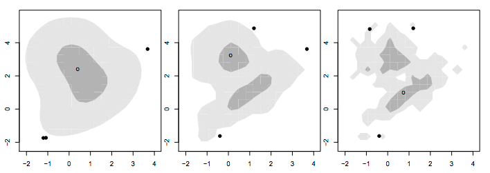
Source: 40 years of boxplots, p. 11
Clockwise Robust Bivariate Boxplot and Rotational Boxplot
These two variations are similar to a HDR Boxplot, but take a more circular approach. On the left is the ‘Clockwise Robust Bivariate Boxplot’ of A. Corbellini and on the right is the ‘Rotational Boxplot’ of S. Muth.
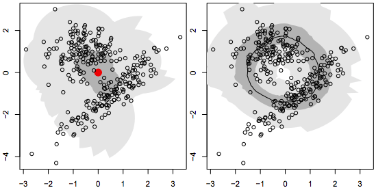
Source: 40 years of box plots, p. 11
Functional Boxplot
This chart visualises the various measures of the data distribution against time or a continuous interval using a series of bands and lines. In the example below, the central black line represents the median, while the blue lines are denoting envelopes. The magenta region is where 50% of the data occurs and the red dashed lines are the outliers.

Further reading:
- Wikipedia entry on Functional Boxplot
- Functional Boxplots, Ying Sun and Marc G. Genton
- Python Module to Create Weighted Functional Box Plots
- Statistical Atlas Construction via Weighted Functional Boxplots
Surface Boxplot
There’s also a 3D variation of a Boxplot, known as a ‘Surface Boxplot’, which functions similar to a Functional Boxplot, but has a 3rd dimension and uses Surface Plots.
The box in middle represents 50% central region, the middle surface inside that box is used for the median surface, and the surfaces on the top and bottom indicate the maximum non-outlying envelope.


