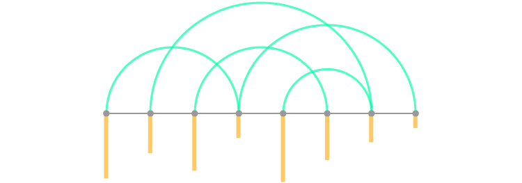
When combining an Arc Diagram with another form of data visualization, the additional graph markers can be placed on or aligned with the connecting nodes of an Arc Diagram
So for example, if an individual node represents a single person in a network, the arcs represent who they’re messaging, and then the additional variable marker (say a bar) attached to the node has a length proportional to the number of messages that user has sent.
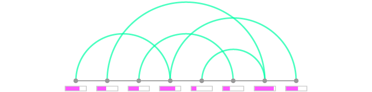
+ Bar Chart
First up is an illustration of the previously presented example: a combination of a Bar Chart with an Arc Diagram.
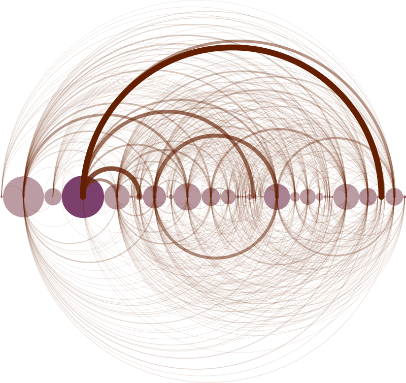
Working together with pastor Christoph Römhild, Christ Harrison produced an Arc Diagram that visualises biblical cross-references. Here, each arc represents the 63,779 cross-references found in the Bible. Chris also combined this diagram with bars at the bottom, which each represent a chapter in the Bible with the lengths corresponding to the number of verses contained within it.
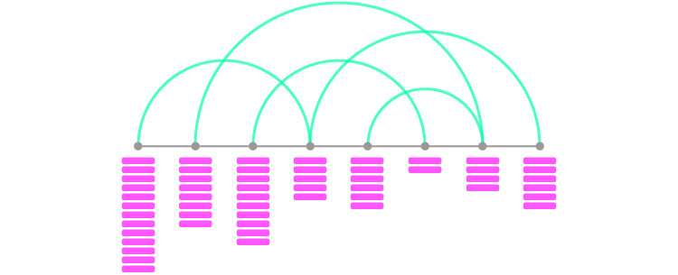
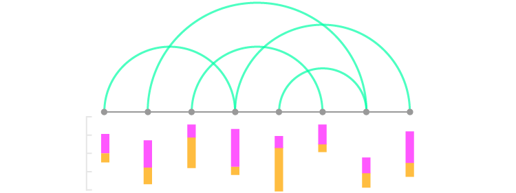
+ Stacked Bar Chart
Of course, if an Arc Diagram can be combined with a Bar Chart, you can be sure that a Stacked Bar Graph can be applied as well.
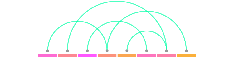
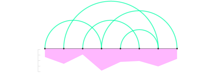
The 100% Stacked Bar Chart variation can also be applied. In the example below, the stacked bars have been fixed to have a uniform total width as a way of displaying part-to-a-whole relationship at each node.
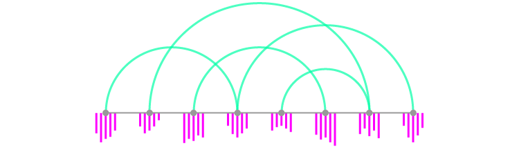
+ Histogram
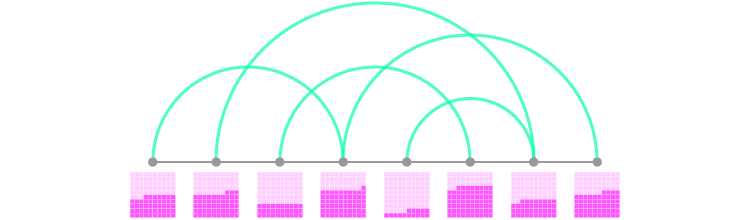
Applying a Histogram or Multi-set Bar Chart be done like in the example below, where each node contains a cluster of bars.
+ Unit Chart
Another way to display discreet, numerical comparisons could be through the use of a Unit Chart. Here, a shape is used to represent a numerical unit (for example, 1 block = 10).
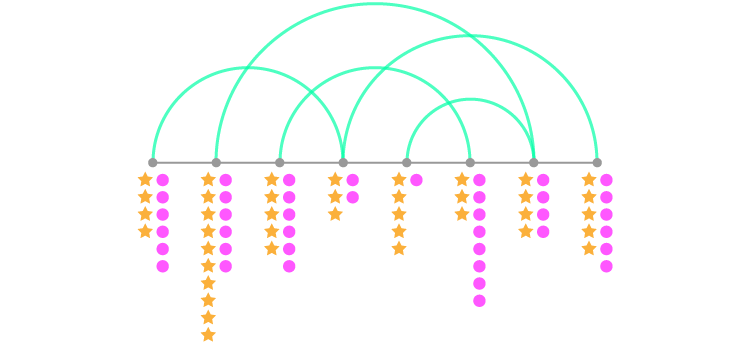
+ Pictogram Chart
Instead of using simple shapes, you could instead substitute them for more detailed icons and uses a Pictogram Chart to combine with an Arc Diagram.
+ Span Chart
Another way to use bar markets on an Arc Diagram could be through the use of a Span Chart – especially if you’re looking to display ranged data. Here, the bars are not attached to each
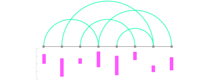
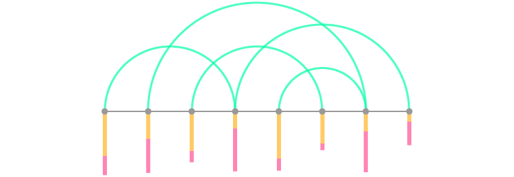
And if you want to have two variables or display sections of the ranges or show a part-to-a-whole relationship of the ranges, then the bars here can be split.
+ Proportional Area Chart
Numerical quantities can also be displayed fairly well through the use of shape areas (like on a Proportional Area Chart) on each node.
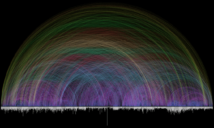
The example below from Martin Dittus visualizes data from IRC (Internet Relay Chat) communication behaviour to see who is speaking to whom, and who is namedropping whom. Here, the size of the circles represents the number of messages sent by each user. The varying color shades of the circles is based on the average message length.
If unlike in the example above, your Arc Diagram doesn’t have arcs on the

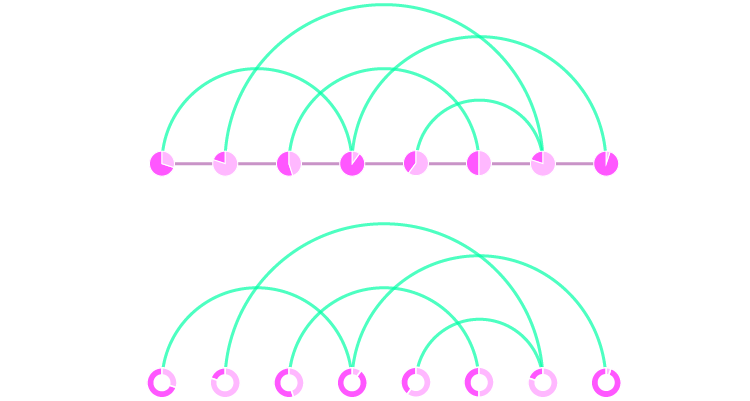
+ Pie or Donut Chart
Replacing nodes with Pie Charts or Donut Charts is a straightforward way to display percentages, although they’re not so fantastic to compare across.
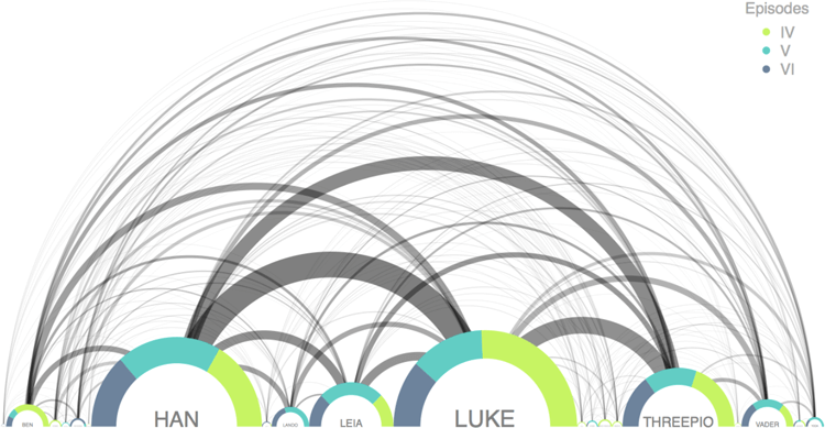
The example below is part of a chart by Gaston Sanchez, which visualizes the script from the original Star Wars trilogy. Here, the semi-circle Donut Charts have been used to show the amount each character speaks across the three movies. The size of each semi-circle Donut Chart is also proportional to the amount of dialogue that character has in total.
If having arcs connecting to other arcs is too much for you, then an alternative design for this chart combination would be to flip the ‘arches’ onto the bottom.

+ Waffle Chart
A clearer way of displaying and comparing percentages could be to use a Waffle Chart under each node.
+ Heatmap
To combine an Arc Diagram with a Heatmap, all you need is to shade shapes near or on each node. Multiple data series can be displayed with additional rows of shaded blocks.
+ Line Graph
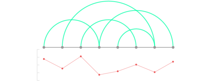
It’s possible to combine an Arc Diagram with a Line Graph, by aligning each point to a node and varying the vertical positioning based on a value axis.
Despite this possibility, this chart combination isn’t actually visualizing data over time (unless each node represents a series of uniformly distributed points in time).
+ Area Graph
Combining with an Area Graph is also another possibility. But like with the previously mentioned Line Graph combination, this isn’t necessarily showing data changing over time and is most likely just showing the data values increasing or decreasing over each node.
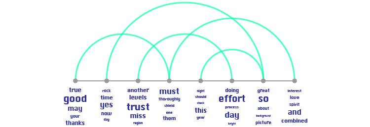
+ Word Cloud
If your network is connected with text-based data, then combining the Arc Diagram with varying sized text like in a Word Cloud is an option.
Here, you could display a few different variables on the text through the choice of word listing,
This chart combination is useful for comparing bodies of text that occur within an interconnected network. For example, in a messaging network, where the arcs signify who is messaging who and the text visualization underneath the nodes shows the most commonly used words or phrases being exchanged.
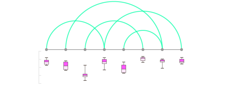
+ Boxplot
Displaying data distribution can be done by aligning Boxplot markers with each node.
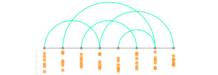
+ Dot Distribution Plot
A simpler way of displaying data distribution can be done by combining with a Dot Distribution Plot.
+ Barcode Plot
Another way to display data distribution with an Arc Diagram is to combine it with a Barcode Plot.
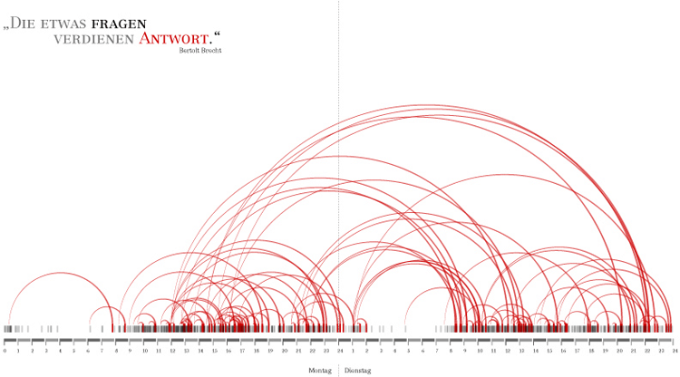
The example below by Matthias Dittrich contains an example of this combination. Here, all emails of a particular weekday were shown on a 24-hour time strip. The replied e-mails are represented by the arcs linking to the original e-mail source. The goal of this visualization was to show when and how fast emails were being answered.